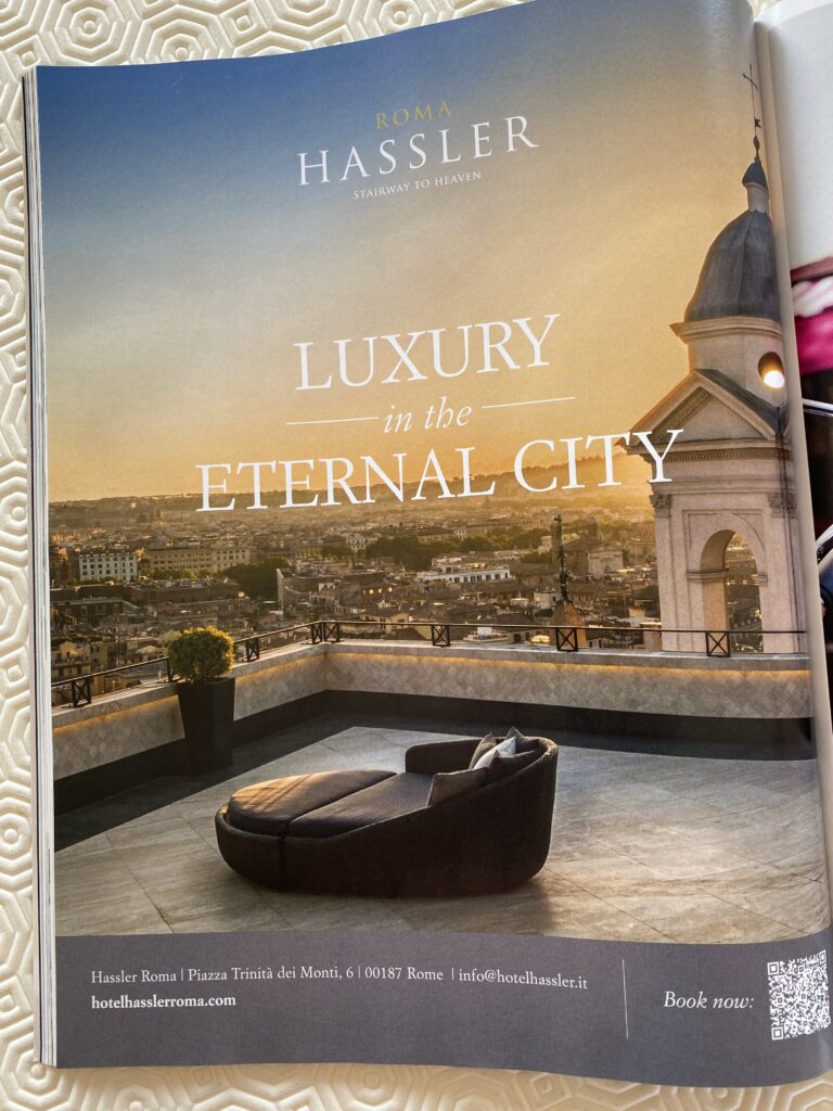
I haven’t critiqued one of these in a while, but as I was flicking through the current edition of Conde Nast Traveller, I saw this advertisement for Hotel Hassler Roma. Apparently, to market a luxury hotel experience these days, all you need is an anonymous rooftop view with what is effectively a fancy sun lounger thrown in for decor.
There’s so much that’s wrong with this. When I used to work agency-side, one of the important lessons I learnt from my creative director was to stress test the copy and image for harmony. To achieve this, remove each component to test if there’s enough context for each element to stand on its own independently, and still create an impact.
Let’s break this down in practice.
The Ad Copy
As a luxury five-star hotel, the Hotel Hassler Roma is in an enviable position, located right at the top of the historic Spanish Steps by the Piazza Trinità dei Monti. Having studied their website, it appears the ‘Stairway to Heaven’ strapline they’ve used in the ad copy, is also part of their digital brand identity.
Online, it works well. You’re instantly greeted with a sweeping video that soars from the Piazza di Spagna up to the entrance of the hotel, perched at the top of the Spanish Stairs. You get to take in the central location, so when you eventually see the strapline beneath the logo, it has meaning.
The print ad lacks context. With no reference to the location other than in the footnote, the meaning of the strapline is completely lost. I’m no expert, but I doubt if 99% of Conde Nast readers would clock the Piazza Trinità dei Monti location and understand the connection. A stairway to where exactly? If you blink, you’ll miss the website at the bottom corner of the page, which is the only tell-tale sign this is an advertisement for a luxury hotel. From the copy, you wouldn’t know what they’re selling (more on this later).
The rest of the copy is lazy. A frequent traveller would know Rome is the eternal city, and there’s no need to signpost this, since it’s already occupying ad real estate at the top of the page. I would have preferred a word play like ‘Eternal Luxury’, which fits into the ethos of the property with a nod to its Roman heritage. An acknowledgment of the hotel’s superior positioning would have been a great selling point a la; ‘Eternal Luxury found moments from the Spanish Steps’.
This could just be me, but the way the stacked positioning of the copy is giving me ‘Sex and the City’ vibes. It works, but only because there’s such minimal copy (which is a good thing).
Call me old fashioned, but I love a QR code. It’s easy and it’s simple for the consumer, while also helping the marketing team track the efficacy of the ad. Well placed and proportionate.
The Ad Creative
This must be the laziest attempt at selling a luxury hotel experience through a visual image. If you litmus test my former creative director’s philosophy, once the copy is removed what’s left is just a mediocre, non-descript image. You could be anywhere. Unless of course you’re a historical expert of Roman architecture and could immediately identify the landmarks in the background to know your exact location.
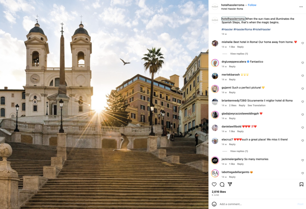
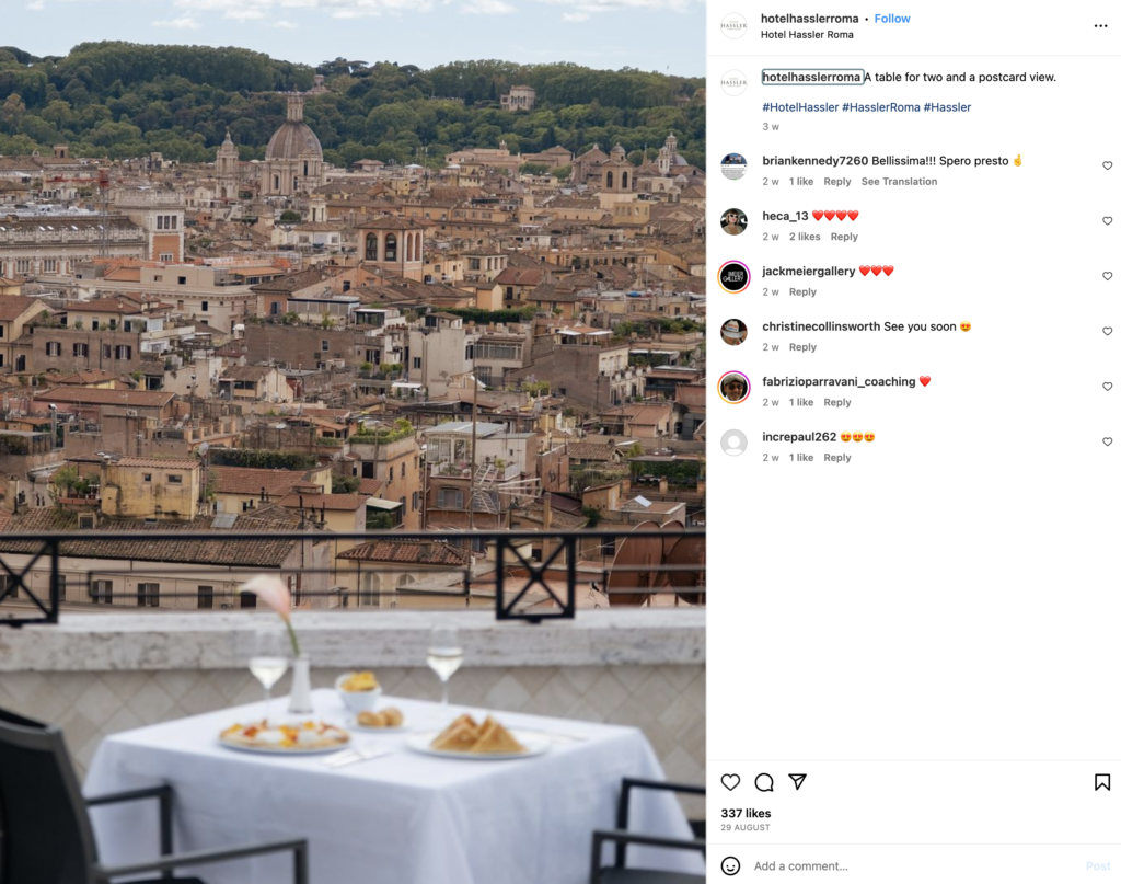
What kills me most is when I looked up the hotel’s Instagram feed, I saw at least two superior images that would have worked better in conveying luxury in a unique and interesting location.
Why this image was chosen is a mystery, especially as it does no favours for the consumer in helping them understand where they are, and what is actually being sold. Is Hassler a premium outdoor furniture brand? Do they sell wrought iron balustrades and awnings? How does this represent luxury? And furthermore, from this image how do we make the connection to a hotel brand that conveys luxury?
I like the element of using ‘the golden hour’ in the photo, as the light is truly spectacular in Rome, especially at dawn and dusk. However, once again it’s a missed opportunity to showcase something a little more desirable to indicate a connection to an exclusive, luxurious experience. Go cliché if you must, but show those beautiful love birds sipping champagne on a terrace with that dreamy look in their eyes. Anything but this.
The Verdict
Conveying the concept of luxury in an advertisement is so much easier when a physical product is the focus. A solo product beauty shot of a luxury watch, or the latest designer handbag will do all the heavy lifting required to create desirability.
In the case of an intangible experience like the Hassler Roma, communicating luxury needs to rely on a combination of inference, familiarity, and something aspirational. So much of what brings the luxury component into a luxury experience is that extra bit of oomph that allows you to stop and appreciate the promise of what’s on offer. Sadly, this was missing for me.